galley font
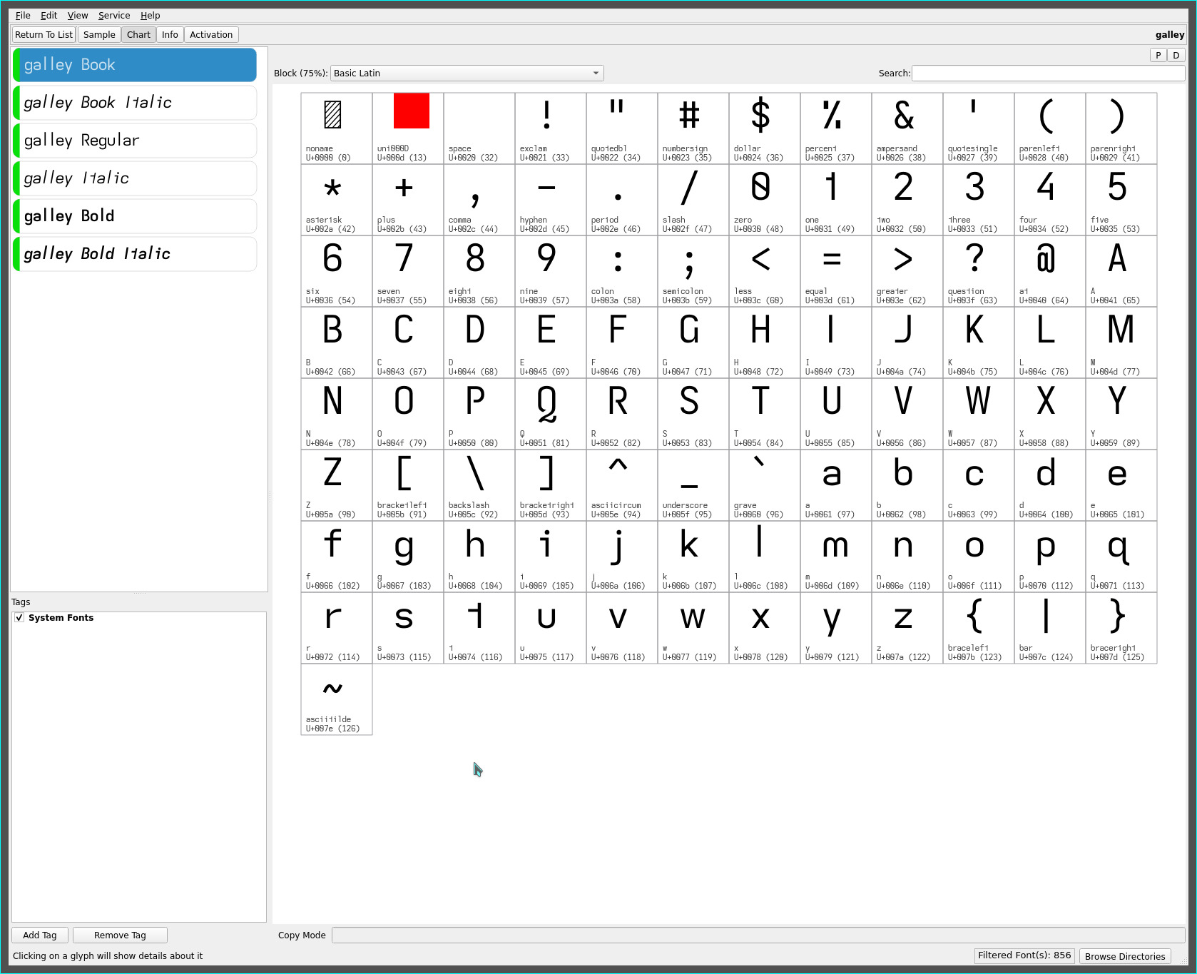
descenders have been a hallmark of the latest fonts presented on this site (amongst other things) but the recent creation of the ascending lower case l has spawned the creation of a typeface with more traditional glyph geometries and a fuller sans serif expression.
Enter the galley font..

the first font from this site with a standard height (non-descending) serifless capital I AND serifless (ascending) lower case l (and no-base One). As well, the swashed capital Q adds its distinctive flair with its heightend readability—a glyph choice departure from previous Q glyph shapes with its more dominant tail stroke—joining the other open capitals with its corner cutout (and the rationale for its choice over my usual minimalist leanings).
While context plays heavily with this typeface for distinguishing between the capital I and lower case l, the ascending cap height of the lower case l is sufficient to highlight the glyph in those rare occasions when it is adjacent or in proximity to the capital I. YMMV.
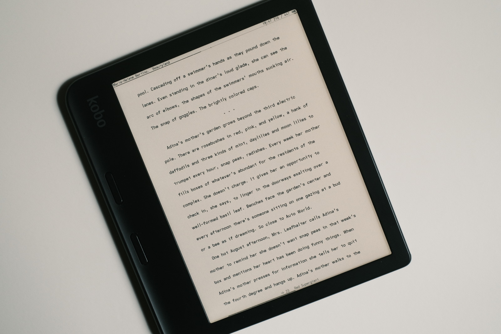
This font is currently my default header/footer and body text font with KOReader—and now allows more “normal” Roman Numeral chapter numbering and avoids the descending capital combinations with all caps headings (which never bothered me but is a welcome visual correction :-)

Additionally, the more traditional glyph geometries (descenders) returns a more open line spacing—always beneficial to readability. i have always been partial to the descending capital I which has been a signature (along with the reversed asymmetric lower case t) with many of this site’s fonts but this font may just have a prolonged honeymoon :-)
faux kerning
newly added for the galley, chalk, pencil, draft and proof fonts is the tightening of the Right Quote UTF-8 U+2019 (and Single Quote UTF-8 U+0027 for plain text ebook instances where the curly apostrophe glyph is not used) cell width—primarily for word contractions such as it’s, we’ll, they’ve, don’t, she’d’ve etc.
This addition joins the cell width adjustments for capitals I J M W and lower case i j l m w to provide a more visually appealing glyph density and legibility whilst still maintaining the overall visual cadence of a monospaced font.
space character width
with galley quickly becoming my favourite ereader font, two versions are now available in the repos:
- 1x full monospaced cell width Space character
- 0.875x monospaced cell width Space character
The tighter cell width spacing renders a more familiar word density akin to kerned fonts—removing the unnecessary side bearing from the blank glyph—not quite as tight, but pleasantly so to these eyes.
Edit: This tighter word spacing also uses the default quasi-proportional extension only em dash and ellipsis cell space widths (versus the custom extended cell widths with the other typefaces).
This loses the word separation emphasis of the 1x Space character but, in turn, provides for a more uniform line density—a dyslexic trade-off for those whose vision can appreciate it.
repos
This font may be found on OneDrive.